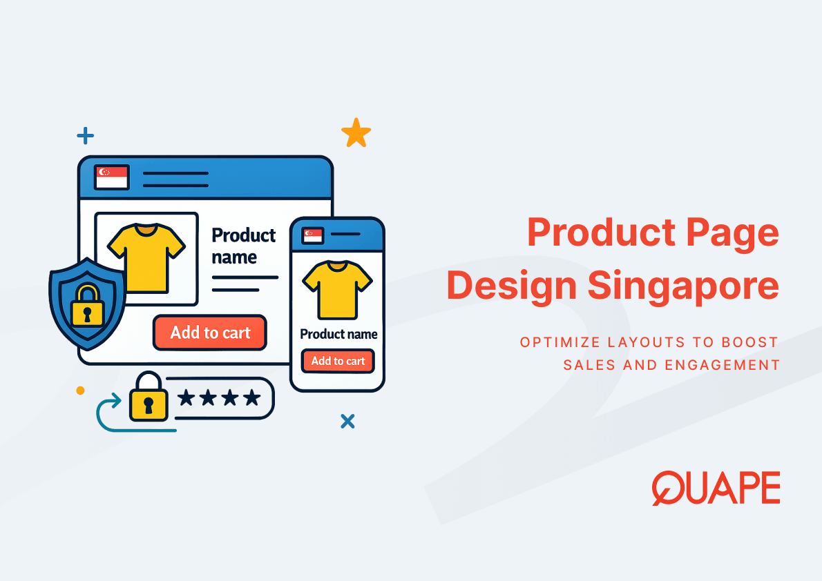
Product page design determines whether interested shoppers become paying customers or abandoned sessions. In Singapore’s competitive ecommerce landscape, where mobile commerce dominates and buyer expectations mirror global standards, the gap between mediocre and optimized product pages directly impacts revenue. Research from Baymard Institute reveals that roughly half of ecommerce sites deliver mediocre or worse product page experiences, causing users to abandon products even when genuine interest exists. For IT managers and CTOs overseeing digital commerce platforms, understanding how product information hierarchy, value messaging cues, and visual prioritization interact with localized buyer behavior patterns becomes essential for building stores that convert browsing into transactions.
Product page design singapore refers to the strategic arrangement of product information, visual elements, and conversion triggers tailored to how Singapore-based buyers evaluate and purchase online. This approach goes beyond aesthetic layouts to address how information hierarchy guides attention, how value messaging reduces purchase hesitation, and how visual prioritization supports rapid decision-making in mobile-first environments.
Poin-Poin Utama
- Mediocre product page UX affects approximately 50% of ecommerce sites globally, directly contributing to lost conversions even among interested buyers
- Product information hierarchy determines whether users can locate essential purchase details without cognitive friction or excessive scrolling
- Value messaging cues must address local preferences for trust signals, delivery clarity, and payment flexibility specific to Singapore markets
- Visual prioritization influences engagement, with 67% of customers finding high-definition visuals more convincing than text descriptions alone
- Localized buyer behavior patterns in Singapore favor mobile-optimized layouts, fast-loading pages, and seamless checkout experiences
- Aesthetic design quality affects perceived usability, reducing cognitive load and supporting faster purchase decisions
- Strategic integration of payment gateways, membership systems, and responsive frameworks directly supports product page performance
Introduction to Product Page Design Singapore
Product page design singapore operates at the intersection of technical implementation and behavioral psychology. When a user lands on a product page, their decision to proceed depends on how quickly they can extract relevant information, assess product value, and trust the transaction process. In Singapore’s market, where smartphone penetration exceeds 90% and consumers frequently comparison-shop across platforms, product pages must deliver clarity within seconds.
Hubungan antara ecommerce web design in Singapore and product page optimization centers on how design frameworks enable consistent information presentation across device types. A well-structured product page reduces the cognitive effort required to evaluate a purchase by organizing details according to user priorities rather than business preferences. This shift from company-centric to user-centric layouts directly influences conversion rates.
Localized buyer behavior patterns shape how Singapore consumers interact with product pages. Factors such as multilingual support, local payment method visibility, and delivery timeframe transparency become decision triggers rather than secondary considerations. When product pages fail to address these localized expectations, users exit to competitors who provide that clarity, regardless of product quality or pricing advantages.
Key Components of High-Converting Product Pages
High-converting product pages function as decision support systems rather than simple information displays. Each component must interact with others to create a coherent narrative that moves users from curiosity to confidence. The sequence in which information appears, the visual weight assigned to different elements, and the clarity of value propositions collectively determine whether a page converts or loses potential customers.
Structuring Product Information Hierarchy
Product information hierarchy organizes content based on user priorities during the evaluation phase. Primary details such as product name, price, availability status, and core specifications must appear above the fold without requiring scrolling. Secondary information like detailed specifications, shipping policies, and return conditions should remain accessible but not compete for initial attention.
Baymard Institute’s research identifying over 1,300 common usability issues across tested ecommerce sites demonstrates how poor hierarchy creates friction. When critical details hide within tabs or appear below multiple paragraphs of marketing copy, users abandon pages because finding essential information requires excessive effort. This pattern intensifies on mobile devices, where screen real estate limitations amplify hierarchy mistakes.
Effective hierarchy structures information in layers that match the user’s mental model of product evaluation. Initial exposure focuses on “Is this what I need?”, followed by “Does this solve my specific problem?”, then “Can I trust this purchase?”. Each layer supports the next decision phase without overwhelming users with premature detail. Understanding ecommerce category structure principles helps designers apply consistent hierarchy across entire product catalogs, reducing the learning curve as users browse multiple items.
Crafting Clear Value Messaging Cues
Value messaging cues communicate why a product deserves attention and purchase consideration. These cues go beyond feature lists to address specific user concerns, highlight differentiation factors, and reduce purchase anxiety. In competitive markets, where multiple sellers offer similar products, value messaging determines which option users perceive as most suitable for their needs.
Effective value messaging integrates emotional and rational elements. Rational cues include warranty terms, compatibility confirmations, and specification comparisons. Emotional cues address aspirational outcomes, problem resolution, or risk mitigation. The combination creates a comprehensive value narrative that supports confident purchase decisions across different buyer psychology profiles.
For Singapore markets, value messaging must account for local preferences around quality assurance, after-sales support, and brand reputation. Messaging that emphasizes local inventory availability, same-day delivery options, or Singapore-specific compliance standards often outperforms generic international value propositions. These localized cues reduce perceived risk and align with how Singapore buyer psychology shapes online purchase decisions.
Visual Prioritization for Maximum Engagement
Visual prioritization assigns prominence to images, videos, and graphical elements that accelerate product comprehension. Research shows that 67% of customers consider high-definition visuals more convincing than text alone when making product decisions. This finding underscores the functional role of imagery beyond aesthetic appeal.
Multiple high-quality images from varied angles allow users to mentally construct three-dimensional product understanding. Zoomable images let shoppers inspect details relevant to their specific evaluation criteria. Context images showing products in use help buyers visualize ownership and application scenarios. Each image type serves distinct cognitive needs during the evaluation process.
Video content adds dynamic demonstration capabilities that static images cannot provide. Product videos showing assembly processes, size comparisons, or feature demonstrations reduce uncertainty about product suitability. However, visual elements must balance engagement value against page load performance, particularly for mobile users on variable network connections. Strategic visual prioritization optimizes this trade-off by loading critical images first while progressively enhancing with supplementary visuals.
Understanding Localized Buyer Behavior Patterns in Singapore
Localized buyer behavior patterns reflect how cultural norms, market infrastructure, and consumer expectations shape online purchase decisions. Singapore’s unique position as a highly digitalized, multicultural market creates specific behavioral patterns that differ from both Western and broader Southeast Asian contexts. Recognizing these patterns allows product pages to align with established user expectations rather than requiring behavioral adaptation.
Mobile-first behavior dominates Singapore’s ecommerce landscape, with most users initiating product research on smartphones regardless of where they complete transactions. This pattern means product pages must deliver full functionality and clarity on small screens without requiring desktop access for critical information. Mobile commerce trends in Singapore show continued growth in mobile-completed transactions, reinforcing the need for responsive designs that prioritize mobile experiences.
Trust signals carry heightened importance in Singapore markets, where reputation and reliability strongly influence purchase decisions. Visible security badges, clear return policies, local contact information, and customer reviews function as trust amplifiers. Product pages lacking these elements face higher abandonment rates regardless of pricing competitiveness. The relationship between trust signals and conversion rates intensifies for higher-value purchases or unfamiliar brands.
Payment flexibility expectations differ from Western markets, with Singapore buyers valuing multiple payment options including regional e-wallets, bank transfers, and installment plans alongside standard credit cards. Product pages that clearly display supported payment methods near pricing information reduce checkout anxiety and abandoned cart rates. This transparency helps users confirm purchase feasibility before investing time in the checkout process.
Practical Design Techniques to Boost Conversions
Practical design techniques translate product page principles into actionable implementation decisions. These techniques focus on removing friction points, accelerating information discovery, and building purchase confidence through strategic design choices rather than aggressive sales tactics.
Sticky “Add to Cart” buttons remain visible during scrolling, reducing the steps required to initiate checkout once users complete their evaluation. This technique particularly benefits longer product pages with extensive specifications or multiple customer reviews. By keeping conversion actions accessible regardless of scroll position, sticky elements reduce the cognitive burden of relocating primary actions.
Clear visual hierarchy through typography, spacing, and color contrast guides attention to priority information without requiring conscious effort from users. Size, weight, and positioning automatically direct eye movement to essential details before secondary content. This visual guidance becomes critical on mobile devices where limited screen space intensifies competition for user attention.
Progressive disclosure patterns reveal detailed information only when users express interest, preventing overwhelming initial presentations while maintaining comprehensive content availability. Expandable specification tables, collapsible review sections, and toggleable shipping details allow users to control information density based on their specific evaluation needs. This approach supports both quick browsers and thorough researchers within the same page structure.
Fast-loading pages directly impact conversion rates, with research showing that 88% of users never return after poor user experiences. Fast ecommerce sites implement image optimization, code minification, and content delivery networks to maintain sub-three-second load times across device types and network conditions. Speed optimization becomes particularly critical for mobile users on variable connections.
Strategic placement of social proof elements like customer reviews, rating summaries, and purchase counts near decision points reduces uncertainty without cluttering primary content areas. Reviews positioned after product specifications but before checkout actions allow users to validate their preliminary interest through peer experiences. This sequencing supports natural decision flow from feature evaluation to social validation to purchase commitment.
How E-Commerce Web Design Supports Product Page Optimization
E-Commerce Web Design establishes the technical foundation that enables product page optimization strategies to function effectively. The relationship between comprehensive ecommerce platforms and individual product pages mirrors how building infrastructure supports room-level design, where foundational capabilities determine what specific implementations can achieve.
Integrated inventory management systems ensure product pages display accurate stock levels and availability status, preventing user frustration from purchasing unavailable items. This integration supports dynamic pricing updates, variant availability tracking, and automated restock notifications. When users encounter accurate information at the product level, trust in the overall platform increases.
Payment gateway integration directly influences checkout experience by determining which payment methods appear during transaction completion. Payment gateways in Singapore must support local preferences for options like PayNow, GrabPay, and regional bank transfers alongside international cards. Product pages that transparently display supported payment methods help users self-qualify purchase feasibility before entering checkout flows.
Membership systems and loyalty programs create return incentives that extend beyond single transactions. When product pages highlight member benefits like exclusive pricing, points accumulation, or early access to new inventory, they transform one-time browsers into recurring customers. This strategic integration supports customer lifetime value growth rather than optimizing only for immediate conversions.
SEO-optimized product page structures improve organic discoverability, reducing customer acquisition costs over time. User-friendly URL structures, semantic HTML markup, and optimized meta information help search engines understand product relevance for user queries. This technical foundation works alongside on-page content quality to drive qualified traffic to product pages.
Businesses seeking to implement these integrated capabilities can learn more about E-Commerce Web Design solutions that connect product page optimization with comprehensive platform functionality. The relationship between individual page performance and overall system capabilities determines long-term competitive positioning in digital commerce markets.
Security infrastructure including SSL certificates, PCI compliance, and secure checkout processes provides the trust foundation that product pages require. Ecommerce trust and security measures work invisibly to users when implemented correctly, creating confidence without requiring conscious attention. Product pages benefit from this background security through reduced purchase hesitation and lower cart abandonment rates.
Kesimpulan & Langkah Selanjutnya
Product page optimization represents a continuous process of aligning design decisions with user behavior patterns and business objectives. Singapore’s competitive ecommerce environment rewards platforms that deliver clarity, build trust, and remove friction from purchase decisions. The interaction between product information hierarchy, value messaging, visual prioritization, and localized behavior patterns creates conversion opportunities that compound over time as user bases grow and repeat purchases increase.
Organizations ready to transform their product page performance should hubungi tim kami to explore how strategic design improvements align with business growth objectives and technical infrastructure capabilities.
Pertanyaan yang Sering Diajukan (FAQ)
What makes product page design different in Singapore compared to other markets?
Singapore buyers expect mobile-optimized experiences, multiple local payment options, and clear trust signals like security badges and return policies. Cultural preferences for detailed product information and social proof through reviews also influence how effective product pages structure content and prioritization.
How many product images should an optimized product page include?
An effective product page includes at least four to six high-quality images showing different angles, with zoomable functionality for detail inspection. Context images showing products in use add value for understanding scale and application, while lifestyle images help buyers visualize ownership scenarios.
Why do some product pages with good products still fail to convert?
Poor information hierarchy, slow loading times, hidden key details, or weak trust signals create friction that overrides product quality. Research shows approximately 50% of ecommerce sites deliver mediocre product page experiences, causing abandonment even among interested buyers who cannot efficiently evaluate purchase decisions.
Should product pages prioritize desktop or mobile layouts first?
Singapore’s high mobile usage rates make mobile-first design essential, with responsive scaling to desktop rather than the reverse approach. Mobile layouts force prioritization of critical information and streamlined interactions that benefit all users regardless of device type.
How do value messaging cues differ from product features?
Product features describe what an item includes or does, while value messaging cues explain why those features matter for specific user needs or problems. Effective value messaging connects features to outcomes, addresses purchase concerns, and differentiates products from alternatives in ways that support confident buying decisions.
What role does page load speed play in product page conversions?
Fast-loading pages directly impact conversion rates because users abandon slow experiences before completing evaluations. With 88% of users not returning after poor experiences, maintaining sub-three-second load times becomes critical for retaining traffic and maximizing conversion opportunities.
Can product pages be too detailed or provide too much information?
Excessive information without proper hierarchy overwhelms users and obscures critical details, but comprehensive content supports thorough evaluation when structured correctly. Progressive disclosure techniques allow detailed information access while maintaining clean initial presentations that serve quick browsers.
How frequently should product pages be tested and optimized?
Continuous testing through A/B experiments on elements like image sequences, value messaging, and CTA placement identifies incremental improvements. Quarterly reviews of analytics data, user behavior patterns, and conversion metrics help prioritize optimization efforts based on actual performance impact rather than assumptions.