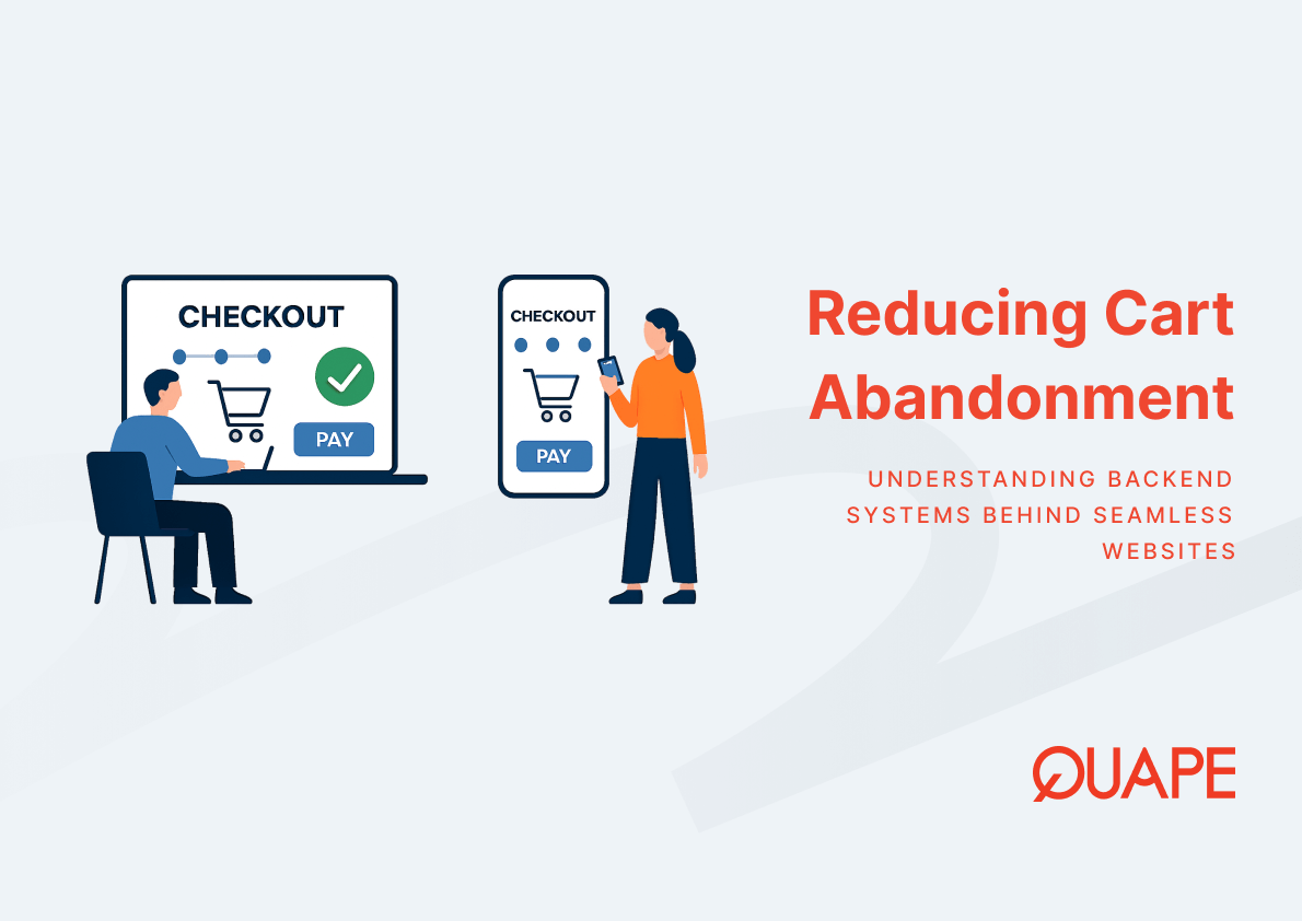
Cart abandonment is one of the most expensive conversion problems an e-commerce business can face. When users reach the checkout stage and leave without completing a purchase, the issue is rarely about product quality or pricing. It is almost always about the experience. For IT managers, CTOs, and developers building or optimising e-commerce systems in Singapore, understanding how checkout UX drives abandonment is essential to protecting revenue. Every friction point in a checkout flow represents a decision point where a buyer chooses to exit. Removing those friction points systematically is what separates stores that convert from those that leak potential sales at the final step.
What Checkout UX Actually Means
Checkout UX refers to the design and interaction quality of every step a user encounters between adding an item to their cart and completing a payment. It encompasses form design, field logic, error handling, payment method availability, mobile responsiveness, and trust signal placement. The quality of this experience directly shapes whether a user completes or abandons the transaction.
Cart abandonment, in this context, is the measurable result of checkout UX failure. When the interaction cost of completing a purchase exceeds a user’s tolerance, they exit. That exit is not a random behaviour. It is a predictable outcome of specific design decisions.
Những điểm chính
- Approximately 70% of online shopping carts are abandoned globally, making checkout UX one of the highest-impact optimisation areas for any e-commerce operation.
- Around 18% of users abandon checkout specifically because the process is too long or complicated.
- Form friction increases cognitive load and directly raises abandonment probability, especially on mobile devices.
- Field minimisation strategies such as autofill, guest checkout, and progressive disclosure reduce interaction cost and improve completion rates.
- Digital wallet support eliminates manual data entry, accelerating the checkout journey and reducing input errors.
- Clear, real-time error validation helps users recover from mistakes instead of exiting in frustration.
- Mobile devices account for over 55% of global web traffic, meaning mobile checkout UX failures have outsized revenue consequences.
- Trust signals such as SSL indicators and payment logos reduce perceived transaction risk at the most sensitive stage of the user journey.
Introduction to Checkout UX and Cart Abandonment
Mối quan hệ giữa checkout UX design and cart abandonment is not abstract. It is a cause-and-effect chain that plays out millions of times daily across e-commerce platforms. According to Baymard Institute, the average documented cart abandonment rate globally sits at approximately 70%. That figure represents a substantial portion of potential revenue that businesses fail to capture, not because demand is absent, but because the path to purchase contains too many obstacles.
For e-commerce operators in Singapore, where digital adoption is high and consumer expectations around payment convenience and speed are equally elevated, the stakes of poor checkout UX are amplified. Buyers who encounter friction do not typically troubleshoot. They exit and often do not return. Conversion rate optimisation, in this context, begins not with traffic acquisition but with removing the barriers that prevent existing visitors from completing their purchase.
Key Components of Checkout UX
Form Friction and Its Impact on Checkout Completion
Form friction describes the resistance a user experiences when interacting with checkout input fields. Long forms, ambiguous field labels, poorly sequenced data requests, and mandatory account creation all contribute to input fatigue. Input fatigue raises cognitive load, which is the mental effort required to complete a task. As cognitive load increases, so does the probability of abandonment.
The usability barrier created by excessive form complexity is particularly damaging on mobile devices. Users navigating a checkout form on a small screen, using a soft keyboard, with limited screen real estate, have a significantly lower tolerance for unnecessary steps. Each additional required field introduces friction that compounds across the full form. The result is not just a slower checkout experience, it is a fundamentally broken one for a growing segment of buyers.
Field Minimisation Strategies for Faster Checkout
Field minimisation is the practice of reducing the number of required inputs to only those that are functionally necessary to complete the transaction. This strategy directly reduces interaction cost, which is the total effort a user must invest to move from cart to confirmation. Lower interaction cost produces faster completion and measurably higher conversion rates.
Autofill compatibility allows browsers and password managers to populate fields without manual input, eliminating a significant source of friction. Guest checkout removes the account creation barrier, which Baymard Institute identifies as a primary driver of abandonment. Progressive disclosure presents only the fields relevant to the current checkout step, reducing the visual complexity a user must process at any given moment. Together, these strategies compress the checkout journey without removing necessary data collection.
Wallet Payment Support and Payment Convenience
Digital wallets interact with checkout UX by eliminating the most friction-heavy component of the entire flow: manual entry of billing and shipping information. When a buyer selects Google Pay, PayPal, or Stripe, their stored data populates automatically. This removes the need to locate a physical card, type a 16-digit number, enter an expiry date, and input a billing address. The cognitive and physical effort collapses into a single authentication step.
For platforms serving payment gateways in Singapore, wallet support is increasingly a baseline expectation rather than a premium feature. According to Worldpay’s Global Payments Report, over 50% of global e-commerce payments are expected to be wallet-based. Failing to support these methods introduces an immediate drop-off point at the payment selection stage, particularly among mobile-first users who rely on device-native wallet integrations.
Error State Clarity and Real-Time Validation
Error states in checkout forms represent a critical decision point in user behaviour. When a user submits incorrect or incomplete information, the quality of the error message determines whether they correct the mistake or abandon the session entirely. Poor error handling forces users into a troubleshooting loop. They are required to identify what went wrong, locate the affected field, understand what the correct format should be, and re-enter the data, all without clear guidance.
Real-time inline validation addresses this by surfacing feedback as the user types, rather than after form submission. According to Nielsen Norman Group, clear and specific error messaging directly reduces user frustration and improves recovery behaviour. Microcopy plays a supporting role here. Short, contextually relevant field-level instructions reduce input errors before they occur. The combined effect of validation timing and message clarity converts error states from exit triggers into recoverable moments.
Mobile Checkout Optimisation and UX Consistency
Mobile commerce trends in Singapore reflect a broader global shift where the majority of browsing and purchasing decisions originate on a smartphone. When checkout UX is designed primarily for desktop and adapted for mobile as an afterthought, the resulting experience is consistently inconsistent. Input fields are too small, tap targets are difficult to hit, and form sequences that work well on a keyboard become laborious on a touchscreen.
Thumb-friendly design principles account for how users physically hold and interact with a device during checkout. Key actions such as payment confirmation, field selection, and error correction should be reachable without requiring grip adjustments. Responsive design ensures visual consistency across devices, but UX consistency requires that the interaction logic, field sequence, and feedback mechanisms also adapt to the mobile context. For platforms referenced in mobile commerce optimisation for Singapore, this distinction between visual responsiveness and true mobile UX maturity is significant.
Trust Signals and Security Assurance in Checkout
Trust signals operate on perceived risk. At the payment stage, a buyer is asked to submit financial data to an entity they may have only encountered for the first time during that session. The presence of SSL indicators, recognised payment logos, and visible data privacy statements reduces the perceived risk of that transaction. Their absence amplifies hesitation at the exact moment when commitment is required.
E-commerce trust and security considerations extend beyond technical implementation. A site may be technically secure, but if that security is not visually communicated at checkout, the user has no way to verify it. Trust badge placement, payment method recognition, and transparent return and refund policies all interact to lower the psychological barrier between browsing and buying. This is particularly relevant for Singapore buyers engaging with newer or smaller e-commerce brands where brand familiarity cannot substitute for visible security assurance.
Practical Application for the Singapore Market
Singapore buyer psychology around digital transactions is shaped by high smartphone penetration, familiarity with digital payment ecosystems, and relatively low tolerance for friction in online experiences. Payment preferences in Singapore skew toward digital-first options, with local systems such as PayNow and broader wallet ecosystems both playing significant roles in consumer expectations. A checkout flow that does not reflect these preferences creates an immediate mismatch between what the buyer expects and what the platform delivers.
Digital adoption in Singapore is also associated with higher baseline expectations for security transparency. Buyers who are comfortable transacting online are also more aware of what a trustworthy checkout environment should look like. This means that the elements discussed across this article, from field minimisation to wallet support to error clarity, are not theoretical optimisations. They are functional requirements for capturing conversion from Singapore’s digitally literate consumer base. Understanding Singapore buyer psychology is essential for structuring a checkout flow that aligns with local behavioural patterns rather than importing assumptions from other markets.
How E-Commerce Web Design Supports Checkout UX Optimisation
Custom e-commerce web design directly enables checkout UX improvements that template-based solutions cannot reliably deliver. When a checkout flow is built on a pre-configured theme, the form structure, field sequence, payment options, and error handling are constrained by the template’s logic. Optimising these elements requires either workarounds that introduce technical debt or a redesign that effectively rebuilds the checkout from scratch.
A conversion-focused design approach, supported by custom API integrations and purpose-built payment system integration, creates the conditions for genuine UX optimisation. The e-commerce web design service from Quape supports integrations with Stripe, PayPal, Google Pay, and custom API-connected payment providers, enabling the wallet support and payment flexibility that Singapore buyers expect. Beyond payment logic, custom checkout design allows field minimisation, validation behaviour, mobile interaction patterns, and trust signal placement to be implemented without compromise. These are not cosmetic decisions. They are structural ones that determine whether a checkout converts.
Kết luận
Checkout UX optimisation is one of the most direct levers available to any e-commerce business looking to grow revenue without increasing traffic spend. By addressing form friction, minimising input requirements, supporting wallet payments, clarifying error states, designing for mobile behaviour, and communicating security credibly, businesses convert the journey that a buyer has already started into a completed transaction. In Singapore’s digital commerce environment, where buyer expectations are high and platform alternatives are plentiful, these optimisations determine which stores retain revenue and which ones lose it at the final step.
If your e-commerce platform is experiencing conversion drop-off at checkout and you want to evaluate how design and integration decisions are contributing to that loss, contact the Quape sales team to discuss a checkout UX review for your store.
Câu Hỏi Thường Gặp
What is the most common reason buyers abandon checkout?
The most frequently cited cause of checkout abandonment is a process that is too long or complicated. Research from Baymard Institute identifies forced account creation and excessive form fields as primary friction drivers. Simplifying the checkout journey by reducing required inputs and enabling guest checkout directly addresses these causes.
How does form field minimisation improve conversion rates?
Reducing the number of required fields lowers the total interaction cost of completing a purchase. Fewer inputs mean less time spent, fewer opportunities for error, and a shorter perceived distance between intent and confirmation. This effect is especially pronounced on mobile devices, where typing is slower and form fatigue sets in more quickly.
Why is wallet payment support important for checkout UX?
Digital wallets remove the manual entry of billing and shipping data, which is one of the most error-prone and time-consuming parts of checkout. When a buyer can authenticate with a single tap, the friction at the payment stage drops significantly. As wallet-based payments account for a growing share of global e-commerce transactions, the absence of this option creates an immediate exit point for a large segment of buyers.
What makes error handling effective in checkout forms?
Effective error handling surfaces feedback at the field level, in real time, with a clear explanation of what is wrong and how to correct it. Vague messages like “invalid entry” force users to guess. Specific messages that identify the field and describe the expected format allow users to recover quickly without abandoning the form.
How does mobile UX affect checkout completion rates?
Mobile devices now account for the majority of global web traffic, and checkout flows that are not genuinely optimised for mobile create significant abandonment risk. Small tap targets, difficult keyboard interactions, and slow load times compound across the checkout journey. A checkout experience designed specifically for mobile behaviour, including thumb-reach optimisation and fast page rendering, reduces these friction points at scale.
What role do trust signals play in checkout conversion?
Trust signals reduce the perceived risk of submitting financial and personal data to an online store. SSL indicators, recognisable payment logos, and visible privacy statements communicate that the transaction environment is secure. Without these cues, buyers who have already selected their items may still exit at the payment stage because the checkout does not visually confirm that their data will be protected.
Does checkout UX require custom development or can templates handle it?
Templates can address basic checkout requirements, but they constrain the depth of UX optimisation available. Field logic, validation behaviour, mobile interaction patterns, and payment integration flexibility are all shaped by the template’s underlying structure. Custom e-commerce development allows these elements to be designed and integrated without the limitations that pre-built themes impose.
How should Singapore e-commerce businesses approach checkout UX differently from global benchmarks?
Singapore buyers interact with a digital commerce environment shaped by high smartphone usage, familiarity with local and regional payment systems, and elevated expectations around transaction speed and security. Global benchmarks provide useful directional data, but checkout design for the Singapore market should account for local payment method preferences, mobile-first usage patterns, and the level of trust signal clarity that a digitally experienced buyer expects.

- Squarespace Alternative: Bespoke UI/UX Design that Converts High-Ticket Clients - Tháng 6 17, 2026
- Wix Alternative for Enterprises: Why You Need Custom Corporate Web Design - Tháng 6 16, 2026
- Dropbox Business Alternative: Avoid High User Licensing Fees with Private Nextcloud - Tháng 6 15, 2026