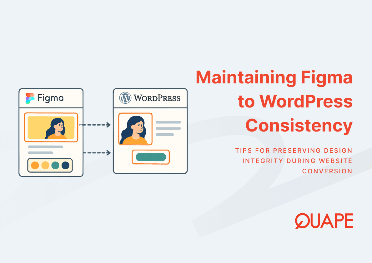
When a Figma design reaches the WordPress development phase, the visual integrity established during design is often the first thing to erode. For IT managers, CTOs, and SMEs in Singapore overseeing digital projects, this erosion translates directly into rework costs, brand inconsistency, and delayed launches. Maintaining design consistency across the Figma-to-WordPress pipeline requires more than pixel-matching; it demands a structured approach to design systems, token mapping, and component governance. The gap between what a designer intends and what a developer implements is rarely caused by negligence; it is caused by the absence of shared standards. Organizations that close this gap early reduce both technical debt and long-term maintenance overhead. This article outlines the specific mechanisms that preserve design fidelity throughout the conversion process.
Introduction to Figma WordPress Design Consistency
Figma WordPress design consistency refers to the degree to which visual and structural design decisions made in Figma are accurately and sustainably reproduced within a WordPress environment. It is not a single action but a continuous alignment between design intent and frontend implementation across typography, color, spacing, components, and layout behavior.
This alignment matters because inconsistency in a live website is not just a visual problem; it is a usability problem. According to the ACM Digital Library, inconsistent UI design increases cognitive load and reduces user task efficiency, particularly in complex enterprise systems. When users encounter visual irregularities across pages, trust degrades, and task completion rates decline. For Singapore businesses operating in competitive digital environments, that degradation carries measurable commercial consequences.
As part of a broader Figma-to-WordPress conversion workflow, design consistency functions as both a quality standard and a governance framework. It defines how design decisions are documented, transferred, and enforced at the code level.
要点总结
- Design systems that include reusable components and tokens reduce interpretation errors during developer handoff.
- Style guides translate visual decisions into enforceable frontend rules for WordPress themes.
- Typography and color are the two most visible markers of design inconsistency and must be explicitly governed.
- CSS variables map Figma color tokens into scalable, centrally controlled frontend properties.
- Global components in Figma should correspond directly to reusable blocks or modules in WordPress.
- Pixel-perfect implementation requires structured QA processes, not just developer attention.
- Singapore SMEs and enterprises face compounded risks from design inconsistency, including brand dilution and SEO impact.
- Long-term maintainability depends on modular, well-documented design systems rather than page-by-page styling.
Key Components of Figma WordPress Design Consistency
Establishing a Unified Design System Across Figma and WordPress
一个 design system functions as the connective layer between Figma and WordPress. It standardizes reusable UI patterns, component libraries, and design tokens so that both designers and developers operate from the same source of truth. According to the Nielsen Norman Group, design systems improve consistency by standardizing reusable components, design tokens, and interaction patterns across digital products.
When a design system is established before development begins, it eliminates the ambiguity that causes most design-to-code divergence. Developers no longer interpret spacing, color, or component behavior independently; they reference defined standards. This structural alignment also supports cross-team collaboration, which InVision research indicates improves for 73% of organizations when shared design systems and style guides are in place.
Translating Style Guides into WordPress Theme Standards
A style guide documents the visual rules that govern a product’s appearance: spacing units, layout grid definitions, heading hierarchies, button states, and branding constraints. When this guide exists in Figma as a living reference, it must be translated into enforceable standards within the WordPress theme. Without this translation, developers default to estimation, which introduces inconsistencies that compound across pages and components.
In WordPress, style guide standards are typically enforced through theme stylesheets, theme.json configuration in block-based themes, and custom CSS rules. Each of these layers corresponds to a design decision documented in Figma. The style guide bridges the two environments by giving developers explicit values rather than visual approximations.
Maintaining Typography Consistency from Design to Code
Typography controls how information is perceived and processed. Font hierarchy, line height, letter spacing, and responsive scaling all influence readability and brand perception. The Interaction Design Foundation identifies typography and color as core elements of visual consistency that directly affect usability and readability in digital interfaces.
When typography decisions made in Figma are not systematically transferred to WordPress, developers often substitute similar but non-identical fonts, apply inconsistent line heights, or fail to implement responsive scaling rules. The result is a WordPress site that visually resembles the design but deviates in ways that affect both aesthetics and readability. Consistency requires that every typographic value defined in Figma has a direct counterpart in the WordPress CSS or theme configuration.
Mapping Color Tokens to CSS Variables
Color tokens in Figma define colors as named, reusable values rather than hardcoded hex codes. When a brand primary color is defined as a token, any update to that color propagates automatically across all components that reference it. This token-based approach, when mapped to CSS variables in WordPress, creates the same scalability on the frontend.
这 W3C CSS custom properties specification establishes that CSS variables enable centralized control of design attributes like colors and spacing, improving maintainability and consistency across web projects. In practice, this means a single CSS variable update in WordPress can propagate a color change across every button, heading, border, and background that references it, mirroring the behavior of Figma tokens. Teams that skip this mapping and use hardcoded values instead create fragmented stylesheets that are costly to update and prone to inconsistency.
Converting Global Components into Reusable WordPress Elements
Global components in Figma, such as navigation bars, card layouts, buttons, and footers, are designed to be used consistently across every screen. In WordPress, these components should correspond to reusable blocks in Gutenberg, widgets in Elementor, or modules in Divi. The structural alignment between Figma components and WordPress elements is what prevents inconsistency from accumulating page by page.
Component-based development reduces inconsistencies and accelerates frontend development workflows, as established in IEEE research on reusable UI architecture. When a developer builds a WordPress button module that corresponds exactly to the Figma button component, including states, padding, and typography, every instance of that button across the site inherits the same behavior. Without this correspondence, each page risks introducing its own variation.
Ensuring Pixel-Perfect Consistency During Development
Pixel-perfect implementation requires a structured QA process that compares the live WordPress output against the Figma design at defined breakpoints. This involves overlay comparison tools, cross-browser testing, and spacing audits at mobile, tablet, and desktop widths. Visual consistency cannot be assumed; it must be verified.
Frontend QA at this level identifies deviations in margin values, font rendering differences across browsers, and component alignment issues that would otherwise pass unnoticed until client review or post-launch. Establishing a QA checklist derived directly from the Figma design specifications gives developers a measurable standard to validate against, not a subjective impression.
新加坡企业的实际应用
Aligning Design Consistency with Local UX and SEO Expectations
Singapore’s digital landscape is characterized by high mobile usage, competitive e-commerce sectors, and sophisticated B2B buyer journeys. Users in this market expect fast-loading, visually coherent interfaces across all devices. Design inconsistencies that might be tolerated in lower-stakes environments create measurable UX friction here, increasing bounce rates and reducing session depth.
Core Web Vitals 和 local SEO performance are directly influenced by how cleanly a design is implemented. Bloated or fragmented CSS caused by inconsistent styling inflates load times and degrades Cumulative Layout Shift scores. A design system that maps cleanly to WordPress theme architecture produces leaner, better-structured code that supports both visual consistency and technical SEO performance.
Ensuring Compliance and Structured Design Governance
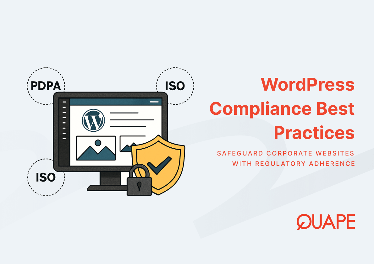
For Singapore enterprises operating under PDPA and ISO-aligned standards, design governance extends beyond aesthetics. UI frameworks that handle user data collection, consent interfaces, and access-controlled content must meet both visual and structural compliance requirements. A consistent design system ensures that these elements are implemented uniformly, reducing the risk of non-compliant variations appearing across different pages or user flows.
Structured design governance also supports audit readiness. When components are documented, versioned, and implemented from a shared system, organizations can demonstrate design decision traceability, which supports both internal review processes and external compliance assessments.
How Figma/PSD to WordPress Supports Design Consistency
Preserving Design Integrity Through Pixel-Perfect Conversion
The Figma/PSD to WordPress service is structured around the principle that every design element must be translated accurately into WordPress, not approximated. This means frontend developers work directly from Figma specifications, including exact spacing values, font weights, border radii, and interactive states. The goal is not a visual similarity to the design but a functional reproduction of it.
Design integrity at this level requires developers who understand both Figma’s design language and WordPress’s technical constraints. The conversion process at Quape prioritizes this fidelity by aligning implementation directly with design tokens and component structures defined in the original Figma file.
Implementing Scalable Design Systems in WordPress
Scalable UI systems in WordPress depend on modular design thinking applied at the theme level. Rather than building pages with unique, one-off styling, a scalable approach creates a library of reusable blocks, each derived from a corresponding Figma component. This modular structure allows future pages to be built from existing elements rather than requiring new development from scratch.
This approach reduces inconsistency by limiting the number of independent styling decisions a developer must make. It also accelerates development cycles, consistent with McKinsey research indicating that companies with strong design systems report up to 34% faster development due to reusable components and standardized workflows.
Enhancing Consistency Across Devices and Performance Layers
Responsive design consistency requires that layout behavior, typography scaling, and component spacing are explicitly defined for each breakpoint, not assumed. When Figma designs include responsive variants for mobile and tablet, those variants must be implemented with equal precision in WordPress. Treating responsive behavior as an afterthought produces sites that are consistent on desktop but visually fragmented on smaller screens.
Performance optimization supports consistency at a system level. Clean, well-structured CSS derived from a design token system loads faster and renders more predictably across browsers and devices. This reduces Cumulative Layout Shift, improves visual stability during page load, and contributes to a more consistent user experience across all access conditions.
Supporting Long-Term Maintainability and Cost Efficiency
Poor frontend consistency can increase development rework by up to 20 to 30% in large-scale web projects, as documented in IEEE research on software engineering practices. For Singapore SMEs managing ongoing WordPress development costs, this rework represents a significant operational risk. Design systems that are properly implemented from the start reduce the frequency of these corrections and simplify future updates.
这 decision between in-house and outsourced WordPress development also intersects with design consistency. Outsourced teams that operate from documented design systems can onboard more quickly, introduce fewer interpretation errors, and maintain consistency across handoffs. This supports long-term lifecycle cost efficiency without requiring constant internal oversight.
结论
Design consistency in a Figma-to-WordPress project is not a cosmetic concern; it is an architectural one. It determines how efficiently a site can be maintained, how reliably it can scale, and how effectively it communicates brand credibility to users. Organizations that establish design systems, enforce token-based styling, and validate implementation through structured QA produce WordPress sites that preserve design intent across every page, device, and future update cycle.
For tailored guidance on maintaining design consistency in your Figma to WordPress projects, 联系我们的团队 to discuss your requirements.
常见问题 (FAQ)
What is Figma WordPress design consistency and why does it matter?
Figma WordPress design consistency refers to the accurate and sustainable reproduction of Figma design decisions, including typography, color, spacing, and components, within a WordPress environment. It matters because inconsistency between design and implementation increases cognitive load, damages brand credibility, and raises long-term maintenance costs.
How do design tokens in Figma connect to CSS variables in WordPress?
Design tokens in Figma assign reusable named values to properties like colors and spacing. When these tokens are mapped to CSS variables in WordPress, a single source of truth is established, allowing global design updates to propagate across all components without manual edits to individual stylesheets.
What role does a style guide play in maintaining design consistency?
A style guide documents the visual rules that govern a product’s interface, including font hierarchies, spacing systems, and color usage. When translated into WordPress theme standards, it gives developers explicit values to implement rather than approximations, significantly reducing interpretation errors during development.
Why do global components in Figma need corresponding elements in WordPress?
Global components like buttons, navigation bars, and card layouts are designed for consistent reuse across all pages. If these components are not reproduced as reusable blocks or modules in WordPress, each page risks developing its own visual variation, which compounds inconsistency and increases maintenance complexity over time.
How does design inconsistency affect SEO and Core Web Vitals?
Fragmented or duplicated CSS caused by inconsistent styling inflates page weight and can worsen Cumulative Layout Shift scores, which is a direct Core Web Vitals metric. A clean, token-based design system produces leaner stylesheets that load faster and render more predictably, supporting both UX quality and search performance.
What does pixel-perfect conversion mean in a WordPress context?
Pixel-perfect conversion means that every spacing value, font weight, border, color, and interactive state defined in Figma is reproduced exactly in the WordPress implementation. It requires a structured QA process that validates the live output against the original design at all defined breakpoints, not a subjective visual match.
How does design consistency support PDPA and ISO compliance for Singapore businesses? Consistent design systems ensure that compliance-critical UI elements, such as consent forms, data input fields, and access-controlled interfaces, are implemented uniformly across all pages. This uniformity reduces the risk of non-compliant variations appearing in different parts of the site and supports audit traceability.
What is the long-term cost impact of poor design consistency in WordPress projects?
Poor design consistency leads to fragmented CSS, duplicated components, and recurring rework cycles. Research in software engineering indicates that frontend inconsistency can increase development rework by 20 to 30% in large-scale projects. Over time, this accumulates into significant technical debt that makes future updates more complex and expensive.