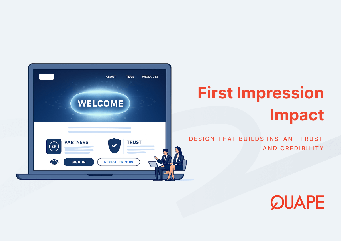
A corporate website is rarely the first touchpoint a prospect has with your brand, but it is almost always where trust is confirmed or lost. For IT managers, CTOs, procurement leads, and business decision-makers in Singapore’s competitive B2B environment, a website that fails visually signals broader operational risk before a single line of copy is read. Visual design is not a cosmetic layer applied after functional decisions are made. It is a credibility system that operates in parallel with every other element of your digital presence. Understanding how perception psychology intersects with corporate site visual design helps you make better design and investment decisions. This article explains why the visual quality of a corporate website has measurable consequences for user behaviour, brand trust, and business outcomes.
Corporate site visual design refers to the deliberate arrangement of visual elements including layout, typography, colour hierarchy, imagery, and spacing to communicate professionalism, build trust, and guide user behaviour. In a corporate context, visual design functions as an organisational signal, conveying competence and reliability before any product or service detail is assessed. It operates upstream of content, meaning it shapes the lens through which all subsequent information is interpreted.
For Singapore-based businesses engaging regional or international clients, corporate site visual design directly influences whether a digital visitor becomes an enquiry. The design system must align with the standards of professional buyers, many of whom evaluate multiple vendors in a single session.
Những điểm chính
- Users form a visual judgement about a website in as little as 50 milliseconds, according to research published in Behaviour and Information Technology.
- Early aesthetic impressions tend to remain stable, meaning a negative first impression is difficult to reverse during the same session.
- Eye-tracking research from Missouri University of Science and Technology shows users take approximately 2.6 seconds to locate the webpage area that most influences their first impression.
- The above-the-fold area carries disproportionate weight in shaping immediate trust perception.
- Visual consistency between brand identity and site design reinforces credibility and reduces cognitive dissonance.
- Poor visual design functions as a business risk factor by increasing bounce rates, reducing engagement, and eroding perceived professionalism.
- Trust signals such as client logos, certifications, and testimonials amplify the credibility established by strong visual design.
- For B2B buyers in Singapore, design expectations have shifted: a visually weak site communicates organisational immaturity regardless of actual service quality.
Introduction to Corporate Site Visual Design
When a prospect lands on a corporate website, their visual system begins processing layout, colour, typography, and spatial relationships almost immediately. This is not a conscious analytical process. It is a rapid, pre-attentive evaluation driven by visual cognition, the same perceptual mechanism that allows humans to assess environments for safety or comfort in a fraction of a second.
The practical consequence for businesses is that corporate web design decisions function as credibility infrastructure. A well-structured layout communicates organisation. A coherent colour system communicates intentionality. Clean typography communicates attention to detail. Each of these signals contributes to a cumulative brand perception that forms before the visitor reads your headline. This is why visual design cannot be treated as a finishing step. It is foundational to how your organisation is perceived at scale, across every session, every device, and every market segment you serve.
The Psychology Behind First Impressions on Corporate Websites
How Perception Psychology Shapes Website Judgement
Perception psychology explains why humans apply rapid, heuristic-based evaluation when encountering unfamiliar stimuli, including websites. When a corporate site visitor processes a page, their brain draws on cognitive shortcuts to determine whether the environment is familiar, trustworthy, or potentially risky. Design elements that conflict with established visual norms for professional environments trigger a sense of dissonance, which elevates perceived risk.
Các trust signals embedded in corporate website design, such as layout consistency, whitespace discipline, and coherent visual hierarchy, reduce cognitive friction. When the visual environment feels organised and intentional, users are more likely to interpret the business itself as organised and intentional. This is the halo effect operating in a digital context: visual attractiveness becomes a proxy for organisational competence. Perception psychology does not operate in isolation; it interacts with brand familiarity, cultural context, and prior experience to produce a composite trust judgement that shapes all subsequent behaviour on the site.
The 50-Millisecond Rule in Visual Evaluation
Research published in Behaviour and Information Technology established that users can form a judgement about the visual appeal of a website in as little as 50 milliseconds. That is one-twentieth of a second. At this speed, no content has been read. No value proposition has been evaluated. The judgement is entirely visual, driven by rapid cognition responding to layout density, colour temperature, typographic clarity, and compositional balance.
The implication for corporate sites is direct: aesthetic quality is not a secondary concern addressed after functionality is resolved. It is the first layer of communication that either opens or closes the door to further engagement. A site that fails the 50-millisecond test does not get a second attempt within the same session. The user’s subsequent evaluation of content, pricing, and service capability will be filtered through the negative aesthetic impression already formed.
Visual Consistency and Brand Credibility
Visual consistency across a corporate site reinforces the perception that the organisation behind it operates with discipline and intention. When typography, colour usage, iconography, and spacing follow a coherent system, the visual experience communicates that the company has invested in its digital brand identity. Inconsistency, by contrast, introduces ambiguity. It signals that different parts of the site were built at different times, by different people, without a unifying standard.
For corporate identity systems, consistency extends beyond visual aesthetics. It includes the alignment between visual tone and business positioning. A professional services firm using playful, inconsistent design creates a mismatch between what the brand claims and what the site communicates. That mismatch reduces credibility, not because the design is inherently bad, but because it contradicts the organisational signals the business is trying to send.
Key Visual Elements That Influence First Impressions
Above-the-Fold Design Strategy
The above-the-fold area is the most contested real estate on a corporate website. It is the section a visitor sees before scrolling, typically containing the navigation bar, headline, subheadline, hero image or video, and primary call-to-action. Eye-tracking research from Missouri University of Science and Technology found that users take approximately 2.6 seconds to fix their gaze on the area that most influences their first impression, which in most cases falls within this visible zone.
Effective UX design for corporate websites treats the above-the-fold section as an information prioritisation decision, not a design exercise. The headline must communicate what the business does and for whom. The visual treatment must reinforce the brand’s positioning. The call-to-action must be visible without requiring deliberate search. When these elements operate in alignment, the above-the-fold section converts attention into engagement. When they compete with each other for visual dominance, the result is cognitive overload and exit.
Visual Hierarchy and Information Scanning
Visual hierarchy is the system by which a designer controls the sequence in which a visitor processes information. Typography scale, contrast ratios, spatial grouping, and colour weight all contribute to directing the eye from the most important element to the least important in a predictable order. When visual hierarchy is well implemented, users scan content efficiently and locate relevant information without effort.
Content scanning behaviour research confirms that users rarely read corporate websites linearly. They apply F-pattern or Z-pattern scanning depending on layout type, extracting key information from headlines, subheadings, and visually prominent elements. An article on corporate website navigation best practices provides additional context on how hierarchy intersects with navigation structure. If the visual hierarchy fails to surface critical information at scanning points, the user may exit before understanding what the business offers.
Website Performance and Perceived Professionalism
Page speed perception is a component of first impressions that operates in parallel with visual design quality. A visually well-designed site that loads slowly creates a contradiction: the visual signals promise professionalism, but the technical performance undermines it. Load latency directly affects user perception of organisational competence, particularly among technical buyers such as IT managers and CTOs who understand the implications of poor infrastructure decisions.
Research on corporate website speed optimisation demonstrates that performance is not separable from design in the context of user experience. When a site renders incompletely, reflows during load, or delays interactive elements, the visitor’s trust in the underlying business is reduced. For Singapore-based companies competing for regional enterprise clients, technical performance is a credibility signal in its own right.
Trust Signals and Credibility Indicators
Trust signals are visual and contextual elements that reduce perceived risk for a site visitor. Client logos, industry certifications, published testimonials, case study summaries, and security badges each contribute to a credibility layer that reinforces the trust initiated by strong visual design. These elements do not function in isolation. They derive their impact from the visual environment in which they are placed.
A poorly designed page makes trust signals appear incidental or even fabricated. A well-designed page makes the same signals appear authoritative and verifiable. The relationship between corporate website trust elements and visual design is reinforcing: strong design amplifies the credibility of trust signals, while weak design neutralises them. For B2B buyers conducting due diligence, this amplification effect determines whether a vendor is shortlisted or dismissed.
Measuring Visual Impact Through Website Metrics
Engagement Signals That Reflect First Impressions
First impressions are not merely perceptual events. They produce measurable behavioural outcomes that are captured in standard website analytics. Bounce rate, which measures the percentage of visitors who leave after viewing a single page, is among the most direct indicators of first impression failure. A high bounce rate on a homepage or key landing page suggests that the visual and experiential quality of the page is insufficient to motivate further exploration.
Time on page, scroll depth, and click-through rate on primary calls-to-action provide additional engagement signals that reflect the quality of first impressions. These metrics are covered in more detail in a corporate web design ROI analysis that connects design decisions to business outcomes. When these signals decline, the root cause frequently sits in visual design quality rather than content relevance, because content is never encountered if the visual experience causes immediate exit.
Conversion Influence of Visual Design
Visual design influences conversion rate through multiple mechanisms. Clarity of call-to-action placement, visual weight assigned to primary conversion paths, and the overall perceived professionalism of the page all contribute to whether a visitor takes the intended action. Conversion rate optimisation that focuses exclusively on copy and offer without addressing visual design frequently fails to achieve meaningful uplift, because the usability and trust barriers created by poor design remain intact.
The relationship between visual design and conversion is not linear. A site with strong design does not guarantee conversion. It removes the visual barriers that prevent a qualified visitor from proceeding. The decision to convert still depends on offer relevance, pricing, and trust in the organisation’s capabilities. However, without the foundation of strong visual design, other conversion factors cannot perform at their potential.
Ứng dụng thực tế cho doanh nghiệp tại Singapore
Design Expectations of Singapore’s B2B Digital Buyers
Singapore’s B2B digital buyers operate within a high-trust, high-expectation market. Procurement leads, finance directors, and senior managers responsible for vendor selection routinely evaluate multiple suppliers through their websites before initiating contact. In this context, a corporate website that does not meet contemporary design standards is disqualifying before any direct interaction occurs.
Singapore web design trends reflect a market that has been shaped by exposure to international digital standards. Buyers in Singapore apply comparisons drawn from global SaaS platforms, multinational corporate sites, and regional enterprise vendors when evaluating local suppliers. A site that looks dated or inconsistent communicates that the company has not invested in its digital presence, which raises questions about investment in other areas of the business.
Building Trust for Regional and International Clients
Corporate websites serving regional markets in Southeast Asia must address trust at multiple levels simultaneously. For international clients evaluating Singapore-based vendors, the website must communicate not only the quality of the company’s work but also its cultural and communicative competence. Language clarity, professional imagery, and navigational logic all contribute to the perception of a company capable of operating across borders.
Multilingual corporate websites address the practical dimension of cross-border business communication by ensuring that localised content does not compromise the visual and structural integrity of the site. A poorly implemented multilingual layer can introduce typographic inconsistencies and layout failures that undermine the trust established by the primary language version of the site.
Compliance and Data Trust Considerations
In Singapore’s regulatory environment, data transparency is a dimension of trust that intersects directly with website design. The Personal Data Protection Act (PDPA) imposes obligations on how organisations collect, use, and disclose personal data, and a corporate website is one of the primary points at which these obligations become visible to users.
PDPA-compliant website design integrates consent mechanisms, privacy notices, and data handling disclosures in ways that are visually coherent and contextually appropriate. When these elements are implemented clumsily, in mismatched visual styles or intrusive placements, they disrupt the user experience and reduce trust rather than building it. Compliance and design must be treated as a unified objective, not separate workstreams.
How Corporate Web Design Supports Strong First Impressions
Chuyên nghiệp corporate web design services address first impression quality through a combination of visual strategy, technical performance, and platform selection. WordPress CMS, when implemented by an experienced developer, supports a visual design system that is maintainable, scalable, and optimised for both user experience and search visibility. A well-architected corporate site uses consistent templates, structured content hierarchies, and performance-optimised assets to deliver a coherent experience across all device types and connection speeds.
Website architecture decisions, including page structure, template consistency, and component reuse, directly influence the visual coherence that users interpret as professionalism. UX optimisation at the component level, covering button states, form design, navigation behaviour, and mobile responsiveness, ensures that the trust established by the initial visual impression is sustained throughout the user journey. Brand presentation at this level of rigour is not achievable through template selection alone. It requires deliberate design decisions made with a clear understanding of the target audience, the competitive landscape, and the business outcomes the site is intended to support.
Kết luận
First impressions on corporate websites are not soft, subjective experiences. They are rapid cognitive judgements driven by visual cognition, shaped by perception psychology, and measurable through engagement and conversion metrics. For Singapore-based businesses competing for the attention of professional buyers, the quality of corporate site visual design is a direct determinant of whether a qualified visitor becomes a conversation. The 50-millisecond window for visual evaluation means that every decision about layout, typography, colour, and composition carries commercial weight. Businesses that treat visual design as infrastructure rather than decoration are better positioned to convert digital attention into business relationships.
If your corporate website is not performing at the standard your business deserves, the team at Quape works with Singapore companies to design and build corporate websites that establish credibility from the first second. Liên hệ bán hàng to discuss your requirements.
Câu Hỏi Thường Gặp
Why do first impressions matter so much for corporate websites?
First impressions on corporate websites are formed within milliseconds and are primarily driven by visual design quality. Research shows that these early aesthetic judgements tend to remain stable, meaning a negative initial impression influences how the rest of the site is perceived, regardless of content quality.
What does the 50-millisecond rule mean for my business website?
It means your website has approximately one-twentieth of a second to communicate professionalism before a visitor forms a visual opinion. At that speed, typography, layout balance, and colour coherence are the only signals available. If these elements are inconsistent or low quality, the impression is negative before any content is read.
Which part of a corporate website has the greatest impact on first impressions?
Eye-tracking research indicates that the above-the-fold section, the area visible without scrolling, carries the most influence on first impressions. This section typically includes the navigation, headline, hero imagery, and primary call-to-action, making it the most important investment in visual design.
How does visual design affect bounce rate?
A poor visual experience increases the likelihood of immediate exit. When a visitor’s first impression of a site is negative, they are more likely to leave without exploring further, which registers as a high bounce rate. This metric is one of the clearest measurable indicators of first impression failure.
Does a professionally designed website improve conversion rates?
Strong visual design removes the trust and usability barriers that prevent qualified visitors from taking action. It does not guarantee conversion on its own, but it enables other conversion factors such as offer relevance, pricing, and trust signals to function at their potential. A poorly designed site neutralises these factors before they are encountered.
What specific trust signals should a Singapore corporate website include?
Client logos, certifications, published testimonials, and case study summaries are among the most effective trust signals for B2B audiences in Singapore. These elements work best when integrated into a visually coherent design system, because the surrounding design quality amplifies or diminishes their credibility.
How does PDPA compliance intersect with corporate website design in Singapore?
PDPA obligations require websites to include consent mechanisms, privacy notices, and data handling disclosures. When these elements are implemented in a visually inconsistent or disruptive way, they reduce rather than build trust. Effective corporate web design integrates compliance requirements as a seamless part of the user experience.
How often should a Singapore company redesign its corporate website?
There is no fixed interval, but a corporate website should be reviewed whenever its visual design falls behind current professional standards, when analytics indicate declining engagement, or when the company’s positioning, service offering, or target market changes significantly. In Singapore’s competitive B2B market, a visually dated site can affect vendor consideration before direct outreach even begins.

- From Design to Live Website: Converting Figma/PSD to WordPress the Right Way - Tháng 4 29, 2026
- How Singapore Businesses Benefit from Figma to WordPress Conversion - Tháng 4 27, 2026
- Integrating Design Systems Between Figma, WordPress, and Other Platforms - Tháng 4 24, 2026