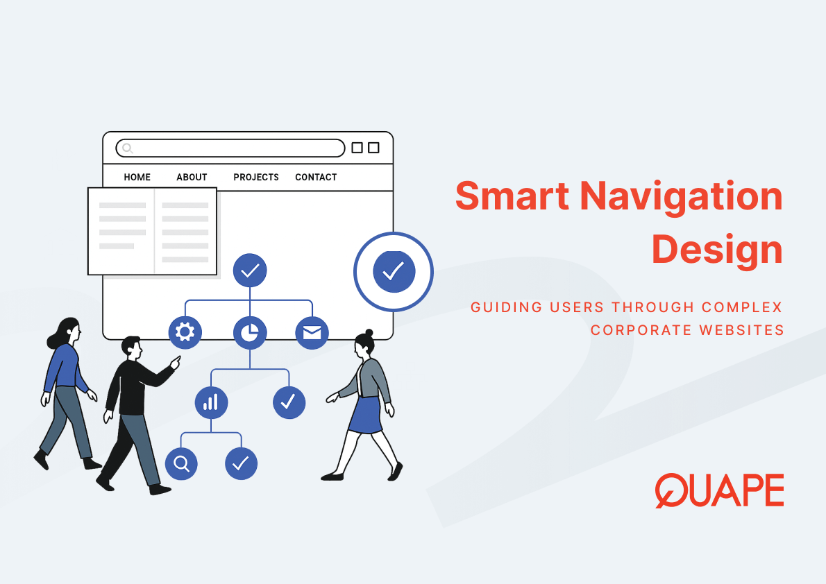
Large corporate websites carry a structural responsibility that smaller sites do not. When a website serves multiple departments, product lines, markets, and user types simultaneously, the navigation system becomes more than a usability feature: it becomes an operational layer that determines whether stakeholders, clients, and partners can reliably locate what they need. Poor navigation architecture on an enterprise site creates real business friction, including lost leads, frustrated users, and content that never reaches the audience it was built for. For IT managers, CTOs, and procurement leads evaluating or rebuilding a corporate digital presence, navigation design is not a cosmetic concern. It sits at the intersection of information architecture, user experience, and commercial performance.
Corporate website navigation best practices refer to the set of structural, labeling, and interaction design principles that govern how users move through large, content-rich websites. These practices determine how content is grouped, how menus are organized, how deep a user must travel to reach a destination page, and how effectively the site supports diverse user journeys across different roles and intent levels.
At an enterprise scale, navigation design also connects directly to search engine crawlability, internal linking architecture, and content discoverability. A well-structured navigation system allows search engines to map and index content efficiently while simultaneously reducing the cognitive load placed on human users navigating complex information environments.
Những điểm chính
- Information architecture forms the structural foundation of all navigation decisions on a corporate website.
- Shallow, broad menu hierarchies outperform deep multi-level structures in both task completion speed and usability.
- Optimized menu organization can reduce user selection time by approximately 25% compared to conventional structures, according to computational menu design research.
- Card sorting and usability testing are reliable methods for validating navigation structures before launch.
- Mega menus, breadcrumb trails, and contextual navigation each address different layers of enterprise content complexity.
- Singapore-based corporate websites benefit from multilingual navigation and accessibility-compliant structures.
- Scalable navigation systems must be designed to accommodate business growth without requiring full structural rebuilds.
- Navigation design directly influences session duration, task completion rates, and content engagement across all user types.
Introduction to Corporate Website Navigation Best Practices
Corporate website navigation operates within a broader system of decisions that includes content strategy, site architecture, and user experience design. Before any menu is drawn or label is written, the underlying structure of how content relates to business objectives must be clearly defined. Navigation is not the starting point; it is the output of deliberate architectural thinking applied to a complex content environment.
For large organizations in Singapore and the broader Asia-Pacific region, corporate websites often serve multiple simultaneous purposes: generating leads, supporting existing clients, hosting regulatory or compliance documentation, and representing the brand to partners and investors. Each of these user groups arrives with different intent and navigates by different mental models. Designing navigation that serves all of them requires more than intuition; it requires structured research, systematic labeling, and scalable architecture.
Hiểu biết how brand-led corporate websites are structured provides essential context before isolating navigation decisions, because the information hierarchy of a site should always reflect the commercial and communicative priorities of the organization it represents.
Information Architecture as the Foundation of Corporate Navigation
Information architecture defines the categories, hierarchies, and relationships that exist between all content pieces within a website. When this architecture is designed to reflect how users actually think about a subject rather than how internal teams organize their work, navigation becomes intuitive. When it reflects internal organizational structures instead, users often encounter labeling and groupings that make sense to employees but confuse external visitors.
A well-constructed information architecture reduces the gap between where a user expects to find content and where it actually lives within the site. This alignment lowers cognitive load, increases task completion rates, and makes navigation feel effortless even on sites with hundreds or thousands of pages.
Structuring Content Hierarchies for Enterprise Websites
Content hierarchies on enterprise websites typically follow a parent-child page model, where broad category pages contain groups of more specific sub-pages. This hierarchical structure creates the navigational backbone that menus, breadcrumbs, and internal links then reflect. The challenge at enterprise scale is maintaining consistent logic across multiple business units, product lines, and service areas without allowing the hierarchy to become fragmented or redundant.
Effective content grouping requires a clear definition of what constitutes a standalone section versus what belongs as a supporting page within an existing category. When these boundaries are ambiguous, navigation labels multiply unnecessarily and users lose the ability to build an accurate mental map of the site.
Taxonomy and Labeling Systems that Improve Discoverability
Taxonomy refers to the naming conventions and classification logic applied to content categories within a site. Labels that use industry jargon, internal terminology, or vague language reduce discoverability because they do not match the language users naturally associate with the content they are seeking.
Semantic navigation relies on labeling that reflects user intent rather than organizational convention. A procurement manager searching for service-level documentation does not use the same language as a marketing team organizing content by campaign. Effective taxonomy bridges this gap by drawing on user research to establish labeling systems that work across multiple audience types without becoming so generic that they lose meaning.
Sitemaps and Navigation Models for Large Websites
Sitemaps serve two simultaneous functions on large corporate websites. HTML sitemaps improve user-facing discoverability by presenting the full site structure in a single accessible location, particularly useful for users who cannot locate content through the primary navigation. XML sitemaps support search engine crawling by providing a structured index of all pages, their relationships, and their priority levels.
For enterprise websites managing hundreds of content pages, the hub-and-spoke navigation model has become an established structural approach. In this model, a central pillar page addresses a broad topic while a cluster of supporting pages covers related subtopics in greater depth. Each spoke page links back to the hub, reinforcing topical authority for search engines while providing users with a clear navigational pathway between general and specific content. Understanding how corporate website content strategy connects to navigation architecture helps contextualize why these structural decisions carry long-term implications beyond initial design.
Menu Depth and Navigation Scalability
Menu depth describes how many hierarchical levels a user must navigate to reach a destination page. Research published in the Oxford Academic journal Interacting with Computers consistently shows that broad, shallow navigation hierarchies outperform narrow, deep structures in both task completion speed and navigation efficiency. Each additional menu level requires a user to make a decision, and each decision introduces the possibility of taking a wrong path.
For enterprise websites, the tension between menu depth and scalability is a practical design challenge. Adding menu levels to accommodate growing content volumes is often the path of least resistance during site expansion, but it transfers complexity to the user experience rather than resolving it structurally.
Optimal Menu Depth for Usability and Crawlability
From a usability perspective, limiting primary navigation to two or three levels prevents the cognitive overload that deeper hierarchies introduce. From a crawlability perspective, search engines assign decreasing priority to pages that require more clicks to reach from the homepage. Pages buried at the fourth or fifth level of a navigation hierarchy may receive less crawl attention and therefore rank with lower visibility in organic search results.
Click depth, which measures the number of navigation steps between the homepage and any given page, should be treated as a technical SEO variable alongside a UX consideration. Enterprise websites that maintain controlled click depth across high-priority content pages benefit both the user experience and the search performance of those pages simultaneously.
Mega Menus vs Multi-Level Menus in Enterprise Websites
Mega menus present all sub-navigation options within a single expanded panel rather than requiring users to open sequential dropdown levels. For websites with large content catalogues, this approach reduces the number of interactions required to reach any given page while also giving users a visible overview of the full content scope within a category.
Multi-level dropdown menus, by contrast, reveal sub-options only when a parent item is selected. This sequential disclosure reduces visual complexity but increases interaction complexity, particularly on sites where users are not already familiar with the content structure. For enterprise clients managing dozens of product or service categories, mega menus typically provide stronger navigation performance because they support scanning behavior rather than requiring sequential decisions.
Designing Navigation Systems that Scale with Business Growth
Navigation scalability requires a modular design approach, where new content categories, product lines, or service areas can be added without disrupting the existing menu structure or requiring a full site rebuild. This is partly a design consideration and partly a CMS architecture decision, because the content management system must support flexible navigation management at the editorial level.
Modular navigation systems establish clear rules for how new sections relate to existing ones, how labeling conventions extend to new categories, and how click depth is maintained as content volume grows. Organizations that define these rules at the outset avoid the common scenario where a navigation system that worked well at launch becomes fragmented and inconsistent after two or three years of business growth.
Navigation UX Patterns that Improve Content Discoverability
Content discoverability depends on more than menu structure. It relies on a layered system of navigation patterns that collectively support users in locating what they need regardless of where they entered the site or how familiar they are with its structure. For enterprise websites, implementing multiple complementary navigation patterns is standard practice because no single mechanism is sufficient to serve all user types and intent levels.
Search Integration for Large Corporate Websites
Site search functions as a parallel navigation channel for users who prefer direct retrieval over browsing. On large corporate websites, where a user might be seeking a specific technical document, policy, or product specification, search integration reduces the dependency on menu navigation and supports task completion for high-intent users who already know what they are looking for.
Effective internal search UX requires more than a search bar. It depends on accurate content indexing, relevant ranking logic, and a results interface that supports filtering and refinement. Enterprise sites that invest in search infrastructure reduce bounce rates among users who would otherwise abandon navigation when the menu structure does not immediately surface their target content.
Breadcrumb Navigation for Complex Website Structures
Breadcrumb navigation displays a user’s hierarchical location within the site at all times, typically as a horizontal trail of parent and grandparent page links positioned above the main content area. This wayfinding mechanism answers the question “where am I within this site” without requiring the user to return to the top-level navigation to reorient.
For complex enterprise websites where users frequently arrive via search engines at deep interior pages, breadcrumbs provide an immediate orientation layer that supports continued engagement. Without breadcrumbs, users who land directly on a sub-page often have no efficient way to understand the surrounding content context or to navigate laterally to related sections.
Contextual Navigation and Cross-Linking Strategies
Contextual navigation refers to navigation elements embedded within page content rather than in the primary menu. Related content modules, inline cross-links, and topic-based navigation panels all function as contextual navigation mechanisms that extend a user’s journey beyond the page they initially landed on.
Internal linking architecture is closely related to contextual navigation and carries dual value: it supports user exploration while also distributing page authority across the site’s content graph. For enterprise websites with deep content libraries, a deliberate chiến lược liên kết nội bộ ensures that supporting content receives consistent visibility and contributes to the topical authority of the broader site rather than existing in isolation.
Navigation Design Considerations for Singapore-Based Corporate Websites
Singapore’s corporate digital environment presents specific navigation design requirements that reflect the country’s multilingual population, high digital literacy rates, and regulatory expectations around accessibility and data compliance. Enterprise websites operating in this market must address these considerations at the architecture level rather than as afterthought additions.
Supporting Multilingual Navigation for Regional Audiences
Singapore’s official working languages include English, Mandarin, Malay, and Tamil. Corporate websites targeting local and regional audiences often need to accommodate multiple languages within a single navigation framework. Language switching introduces navigation complexity because the site must maintain structural consistency across all language versions while also adapting labels and content to the conventions of each language.
Effective multilingual navigation architecture requires more than translated labels. It requires a consistent URL and sitemap structure across language versions, clear language selector placement within the global navigation, and content that is genuinely localized rather than machine translated. For companies operating across Singapore, Malaysia, and other Southeast Asian markets, this multilingual infrastructure supports both usability and search visibility in each target region.
Compliance, Accessibility, and User Expectations in Singapore
Singapore’s digital accessibility standards and the requirements of the Personal Data Protection Act both influence how corporate website navigation should be designed and tested. Accessible navigation design ensures that users relying on assistive technologies, including screen readers and keyboard navigation, can move through the site without encountering barriers created by complex menu structures or non-semantic HTML.
Accessible corporate web design requires navigation elements to be clearly labeled, logically ordered in the page source, and operable without a mouse. Deep or visually complex navigation systems disproportionately affect users with visual impairments, creating compliance exposure alongside usability failures. For enterprise clients with PDPA obligations, accessible and transparent navigation also reinforces trust signals that influence how users perceive data handling and consent mechanisms across the site.
How Corporate Web Design Improves Navigation for Large Enterprise Websites
A professionally designed corporate website integrates navigation planning into the earliest stages of the design process rather than treating it as a final layout decision. This means information architecture research, user journey mapping, and content hierarchy planning all inform the navigation system before any visual design decisions are made.
CMS-driven navigation management allows content teams to update menu structures, add new sections, and reorganize categories without requiring developer intervention at every step. For large organizations where content ownership is distributed across departments, this editorial flexibility prevents the navigation from becoming a bottleneck or falling out of sync with the actual content available on the site.
Scalable corporate web design solutions that account for navigation architecture from the outset allow organizations to grow their digital presence without the disruptive cost of structural rebuilds every few years. The navigation system should be designed to accommodate the website the organization will have in three to five years, not only the site that exists at launch.
Kết luận
Navigation design on a large corporate website is an architectural discipline, not a visual styling exercise. The decisions made about content hierarchy, menu depth, labeling systems, and contextual linking collectively determine whether users can reliably find what they need, whether search engines can efficiently index the full content library, and whether the site remains maintainable and scalable as the organization grows. For Singapore-based enterprises operating in multilingual and compliance-sensitive environments, these considerations carry additional layers of technical and regulatory significance. Organizations that invest in structured navigation planning at the design stage avoid the compounding costs of retrofitting architecture onto a site that has already accumulated complexity.
If you are planning a new corporate website or reviewing the navigation structure of an existing one, contact the Quape team for guidance on building scalable, user-focused navigation architecture: https://www.quape.com/contact-us/
Câu Hỏi Thường Gặp
What is information architecture and why does it matter for corporate website navigation?
Information architecture defines how content is categorized, labeled, and organized within a website. For corporate sites with large content volumes, a clear architecture ensures that navigation reflects how users think about topics rather than how internal teams organize their work, which directly improves usability and content discoverability.
How deep should a corporate website navigation menu go?
Most usability research supports limiting primary navigation to two or three levels. Deeper hierarchies increase the cognitive effort required to navigate and can reduce the crawl priority search engines assign to deep interior pages, creating both UX and SEO disadvantages.
What is a mega menu and when is it appropriate for enterprise websites?
A mega menu presents all sub-navigation options within a single expanded panel, allowing users to see the full scope of a content category at once rather than opening sequential dropdown levels. It is most appropriate for enterprise websites with large content catalogues where users benefit from scanning multiple options simultaneously.
What is the difference between primary navigation and contextual navigation?
Primary navigation refers to the global menu structure that appears consistently across all pages, typically in the header. Contextual navigation refers to links and related content modules embedded within page content that guide users to relevant supporting pages based on the specific topic they are currently reading.
Why is breadcrumb navigation important for large corporate websites?
Breadcrumbs display a user’s hierarchical location within the site at all times. For enterprise sites where users frequently arrive via search engines on deep interior pages, breadcrumbs provide an immediate orientation layer that supports continued engagement and lateral navigation to related sections.
How does multilingual navigation affect corporate website architecture?
Multilingual navigation requires a consistent URL and sitemap structure across all language versions, clear language selector placement, and genuinely localized content. Without a structured multilingual architecture, navigation becomes inconsistent across language versions and search visibility in each target language suffers.
What role does site search play in enterprise website navigation?
Site search functions as a parallel navigation channel for users who prefer direct content retrieval over menu browsing. On large corporate sites, accurate internal search reduces the dependency on menu navigation and supports task completion for high-intent users seeking specific documents, specifications, or policies.
How does navigation design affect PDPA and accessibility compliance in Singapore?
Accessible navigation design ensures that users relying on screen readers or keyboard navigation can move through the site without barriers. For Singapore-based enterprises with PDPA obligations, transparent and accessible navigation also reinforces user trust in how the site handles data consent and privacy-related content.

- Squarespace Alternative: Bespoke UI/UX Design that Converts High-Ticket Clients - Tháng 6 17, 2026
- Wix Alternative for Enterprises: Why You Need Custom Corporate Web Design - Tháng 6 16, 2026
- Dropbox Business Alternative: Avoid High User Licensing Fees with Private Nextcloud - Tháng 6 15, 2026