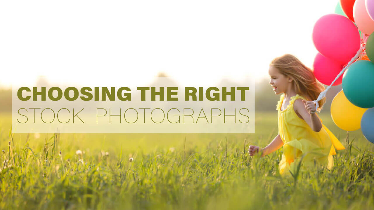
Having a headache choosing the right stock images for your banner or any other designing work? Here are some tips for you to consider when doing so!
#1 AVOID OVERUSED PHOTOGRAPHS
Does it happen to you when you see a familiar model and/or the same exact image that appear on almost any kind of advertisement banners and you go “That’s probably a purchased stock image. It’s so cliche!”.
It is important to keep in mind that users can easily identify overused photos. Your brand and/or any message you are trying to communicate should have a level of uniqueness. For example, hire a professional photographer to shoot relevant photographs for your business. If you are unable to do so, then at least try to look for more relevant and less often used ones – make them look real and genuine.
#2 TEXT-FRIENDLY IMAGES AND REMEMBER TO TEST IT!
Imagine if you are looking for suitable images to place your message text on it, before making any purchases, ask yourself this: Does this stock image allows me with adequate space to place my text?
The text on a banner needs to be visible to users or else that would defeat the purpose.
You can try it out by using the watermarked image preview. If you liked the outcome, then you make the purchase. Imagine having to turn a portrait image you just bought into a horizontal website banner!
Hey, we are not saying it’s impossible but according to our experience… we wouldn’t recommend it.
#3 MAKE IT PERSONAL; CHOOSE ANIMALS AND/OR PEOPLE
Instead of choosing those generic ones, go for images that have people and/or animals in it. It allows the user to feel connected to your content and increases the relatability.
#4 CONSIDER YOUR AUDIENCE
If you are a corporate company trying to look professional, then go for corporate images. On the other hand, if you are a lifestyle brand or a more casual and fun company, consider choosing more trendy and cool images.
Compare Apple and IBM’s choice of photography used on their websites.
#5 KEEPING IT RELEVANT
I’m sure you have seen some stock images where the technology, clothing and more are not the kind we have seen in recent years – because they are outdated.
What are you trying to reflect on your company? So pay attention to details when you are choosing images.
#6 COLORS
Make sure your images convey a consistency either with your brand or within the series of images used. This increases the level of professionalism of your brand, website and/or advertisement.
#7 LICENSING ISSUE
Stock image is a cheaper alternative as compared to hiring someone and take professional photography. However, if you ended up being sued for misusing the stock images, then you are not saving any money. Try to make it a habit and double-check the license of the stock image. When in doubt, contact the owner of the images or simply choose another image.
However, some reputable sites will state it very clearly what their images may be used for.
For example:
“This image can only be used for editorial purposes. Use of this image in advertising, commercial or for promotional purposes is prohibited unless additional clearances are secured by the license.”
We hope the above tips will help you in better choosing the right stock images you need while designing your website or something else! Visit our website to read more interesting tips!
Do you like this post ?
Share this post


QUAPE PTE LTD
Get in Touch!
60 Paya Lebar Road
#07-54 Paya Lebar Square
Singapore 409051
Sales@quape.com
+65 9858 7144
9am - 6pm
Follow us
We Accept

Empowering Digital Excellence | Singapore Web Design, Hosting, Mobile Apps Development Company | © 2024 QUAPE PTE LTD | UEN: 201108334D