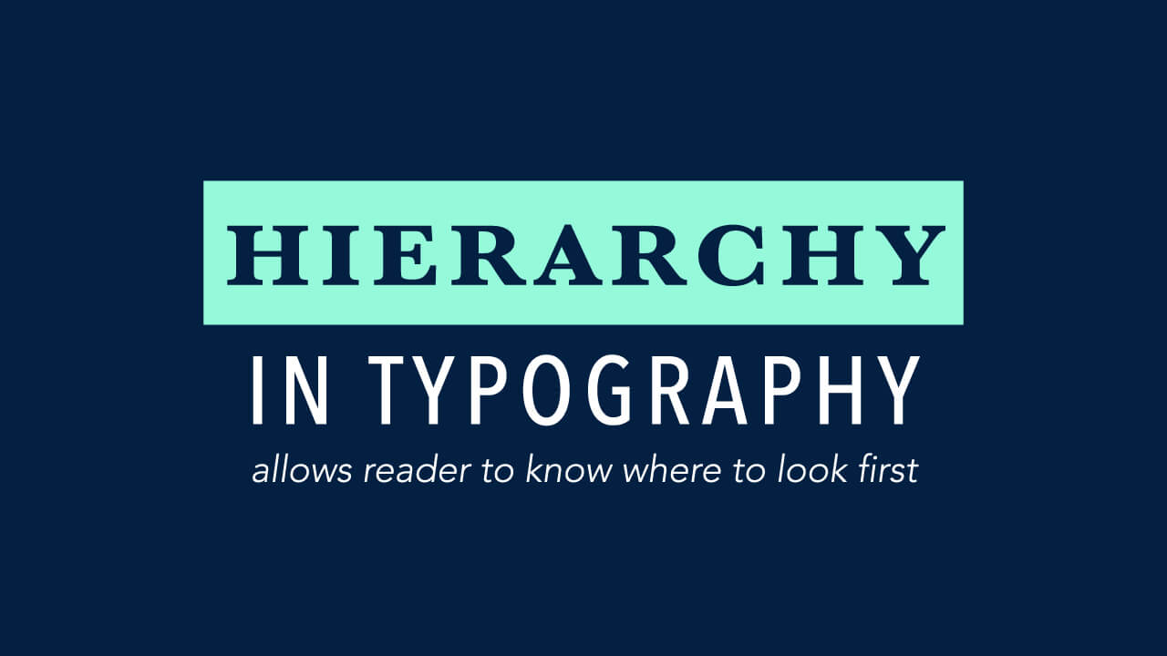
Hierarchy in Typography
Wait, what?
You probably have heard of the word ‘Typography’ and ‘Hierarchy’ but what does it mean when you put them together? To keep it simple, it refers to the way you organize and arranges your text so that the reader’s eye can easily navigate the content. Typography hierarchy can be achieved by making use of the variation of font choice, size, type weight, color and/or placement of type.
So how can I create an effective hierarchy?
#1 THREE LEVELS OF TYPOGRAPHY HIERARCHY
It may not be easy to master the skill right away. But keep in mind these three levels of typography hierarchy and you should be on the right track!
- Level One: At this hierarchy level, your typography should be the most immediate visible typographic element – the most important message you wish to capture your reader’s attention.
- Level Two: Your text elements at this level is commonly used to help organized your design into sections. They are prominent enough to inform your readers that they are looking at a different parts of the design, but they do not stand out as much as your level one element.
- Level Three: This is where your heavy text comes in. The font size used here will be likely smaller as compared to the other two levels. Therefore, it should be easy to read regardless the length of your text content.V
#2 MIX AND MATCH
It was mentioned earlier in this article how we can achieve typography hierarchy by using the variation of font types and colors. Below are some examples that may help you understand more:
Zero Hierarchy

Usage of Font Size and Weights

Usage of Color

Usage of Different Fonts

Hope the above tips may help you in your design!
Do you like this post ?
Share this post


QUAPE PTE LTD
Get in Touch!
60 Paya Lebar Road
#07-54 Paya Lebar Square
Singapore 409051
Sales@quape.com
+65 9858 7144
9am - 6pm
Follow us
We Accept

Empowering Digital Excellence | Singapore Web Design, Hosting, Mobile Apps Development Company | © 2024 QUAPE PTE LTD | UEN: 201108334D