When a design file moves from Figma into WordPress development, the translation process is rarely seamless. Gaps between design intent and technical execution create friction that delays timelines, increases revision cycles, and produces websites that look slightly off from what was originally approved. For IT managers, CTOs, and procurement leads in Singapore, understanding where this friction originates is not a design concern alone. It is a project governance and cost management issue. The decisions made inside a Figma file directly shape how long development takes, how much it costs to maintain, and whether the final website performs well on search engines and across devices.
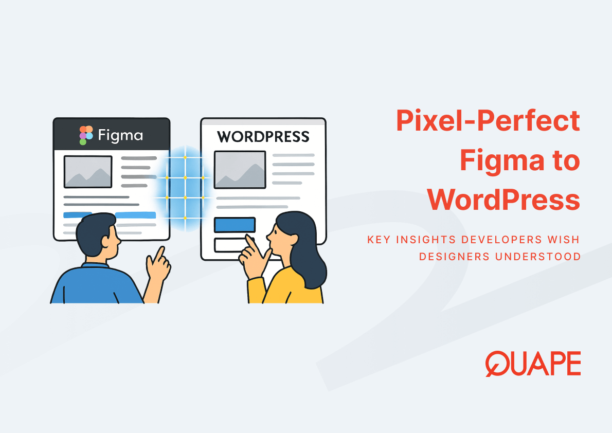
Introduction to Pixel Perfect Figma WordPress
Pixel-perfect Figma to WordPress refers to the process of translating a design file into a functioning WordPress theme or page builder layout with the highest possible fidelity to the original design. It involves design-to-code translation that preserves visual spacing, typography, color relationships, and component behavior across browsers and devices. The term “pixel-perfect” carries a degree of nuance in practice. Rendering differences between operating systems, browsers, and screen densities mean that absolute precision to the pixel is technically impossible in all contexts. What developers actually aim for is structural and visual fidelity that holds up across the environments where real users interact with the site.
This goal connects directly to UI/UX fidelity. When a WordPress theme deviates visibly from the approved design, it erodes trust in the digital product and creates downstream problems for brand consistency. The Figma to WordPress conversion process depends on a chain of decisions made in the design file itself. A well-prepared file accelerates development. A poorly prepared one introduces ambiguity at every stage of frontend development and WordPress theming.
Key Takeaways
- Design tokens function as a single source of truth for colors, typography, and spacing, and they map directly into CSS variables during WordPress development.
- Component libraries reduce duplication by aligning reusable UI patterns in Figma with modular WordPress theme blocks.
- CSS Grid enables higher layout fidelity than older methods, but developers need grid definitions to be explicit in the design file.
- Responsive breakpoints defined in Figma must correspond to actual browser behavior, not just visual mockups at fixed widths.
- Developer handoff quality directly determines how many clarification cycles a project requires before delivery.
- Clean, well-named design files reduce implementation time and lower the risk of inconsistency between design and live output.
- According to Forrester Research, consistent design systems can reduce design and development time by up to 34%.
- Singapore businesses pursuing digital transformation need design-to-development workflows that are scalable, not just visually appealing.
Key Components and Concepts of Pixel Perfect Figma WordPress
Design Tokens as the Foundation of Visual Consistency
Design tokens are named variables that store the visual decisions of a design system. A color is not just #2D6BE4. It is --color-primary-500, a token that can be referenced consistently across every component in a design file and then exported into CSS variables during WordPress theme development. When design tokens are defined properly in Figma, developers do not need to guess whether a particular blue on one component is the same shade used in a button elsewhere in the file.
The relationship between design token standardization and development speed is not theoretical. Nielsen Norman Group notes that design systems built around reusable components and tokens improve consistency and reduce development time by standardizing UI decisions across teams. For WordPress projects, this translates into fewer style overrides, less duplicated CSS, and a theme that is easier to maintain after launch. A design file that lacks token discipline forces developers to reconstruct visual logic that the designer already decided on, which wastes time and introduces inconsistency.
Typography scale and spacing units follow the same logic. When type sizes and spacing values are tokenized rather than applied as one-off numbers, developers can build a spacing system in WordPress that mirrors the design system, rather than approximating it.
Component Libraries and Reusable UI Patterns
A component library in Figma organizes UI elements into named, reusable patterns. Buttons, cards, navigation bars, and form inputs are each defined once and referenced throughout the file. This approach aligns directly with how modern WordPress development works. Whether using Elementor, Divi, or a custom block theme, developers build with reusable modules. When the design file reflects that same modular structure, the handoff between design and code becomes a matching exercise rather than an interpretation exercise.
Atomic design thinking supports this alignment. When designers structure components from the smallest element outward, developers can identify the WordPress equivalent at each level. A Figma button component becomes a reusable button block. A card component becomes a custom post template. The more the design file mirrors how the frontend will actually be constructed, the fewer interpretive decisions developers need to make independently.
Scalable interfaces depend on this alignment. A component library that is maintained and consistent in the design file produces a WordPress theme that is easier to extend when new pages or features are needed post-launch.
CSS Grid and Layout Precision in Development
CSS Grid enables two-dimensional layout control, meaning developers can align elements across both rows and columns with precision. The W3C specification for CSS Grid defines it as a layout system built for exactly the kind of structured, multi-axis positioning that Figma’s auto layout and frame system supports. When a designer uses Figma’s frame and auto layout features with consistent column grids, the developer has a direct reference for how to construct the CSS Grid structure.
The risk emerges when design files use Figma’s grid overlay as a visual reference but do not apply it consistently across all components. A developer looking at a card that sits slightly outside the defined column grid must decide whether that offset is intentional or an error. Multiply that ambiguity across dozens of components and the result is a live site that accumulates small spacing discrepancies that collectively undermine the pixel-perfect goal.
Flexbox and CSS Grid are complementary tools in frontend layout rendering. Designers who understand that Figma’s auto layout maps closely to flexbox behavior, while the column grid maps to CSS Grid, can structure their files in ways that communicate layout intent more precisely.
Responsive Breakpoints and Device Adaptation
Responsive breakpoints define the points at which a layout changes to accommodate different viewport sizes. In Figma, designers often create separate frames for desktop, tablet, and mobile views. These frames function as references for how the layout should behave at those widths. However, the browser does not snap to fixed widths. It scales continuously, which means the breakpoint definitions in CSS must account for the full range of behavior between those Figma frames.
Mobile devices account for over 55% of global web traffic according to Statista, which makes responsive breakpoint accuracy a direct business concern rather than a purely technical one. A WordPress site that breaks or misaligns between breakpoints affects usability and SEO performance simultaneously. Google’s mobile-first indexing means that layout problems on smaller screens affect how the page ranks, not just how it looks.
For Singapore businesses serving users across a wide range of devices, from budget Android smartphones to high-resolution MacBook displays, cross-device compatibility requires that breakpoints in the design file and the UX strategy are defined with real browser behavior in mind, not just as visual placeholders at round-number widths.
Developer Handoff and Collaboration Efficiency
Developer handoff is the structured transfer of design specifications from the designer to the frontend developer. In Figma, the inspect panel provides access to spacing values, font sizes, color codes, and layer properties. When the design file is organized and tokens are applied consistently, the inspect panel becomes a reliable reference. When the file is inconsistent, developers must make judgment calls that may not align with design intent.
Research published by the IEEE has found that developer handoff tools reduce misinterpretation between designers and developers by providing exact specifications. The corollary is that those tools only work as intended when the design file is prepared to support them. A handoff process that relies on ad-hoc Slack messages and annotated screenshots creates delays and introduces errors that structured documentation would prevent.
Collaboration workflows built around clear naming conventions, spacing rules, and consistent token usage reduce the number of clarification cycles in a project. Documented handoff processes and tooling standards also reduce dependency on specific individuals. When a developer can reference the file directly and trust what they see, the project moves faster and produces more accurate output.
Design File Optimization for Performance and Accuracy
A Figma file with thousands of unnamed layers, inconsistent component references, and mixed use of local and external styles creates significant friction during development. Developers spending time interpreting file structure are not spending time writing code. Research from the ACM identifies poorly optimized design files as a contributor to development complexity and performance inefficiencies during implementation.
Asset export settings matter as well. When images and icons are not exported at the correct resolution or in the right format from Figma, developers either produce suboptimal assets or request re-exports. SVG icons that are not cleaned up before export add unnecessary markup. PNG images exported at incorrect dimensions require additional processing. These inefficiencies accumulate across a full project and affect both development timelines and the final performance of the WordPress theme.
Naming conventions directly influence how quickly a developer can locate and reference specific components. A layer named “Card / Product / Hover State” is immediately interpretable. A layer named “Rectangle 47” is not. The discipline of maintaining clean file structure is a professional responsibility for designers working in production environments.
Practical Application for Singapore Businesses
Singapore’s digital ecosystem operates at a pace that rewards structured, repeatable processes. For SMEs pursuing digital transformation and enterprise teams standardizing web delivery, the gap between design and development is often where project budgets overrun and timelines slip. The causes are rarely technical in isolation. They are organizational, rooted in workflows that treat design and development as sequential handoffs rather than collaborative processes.
Procurement leads evaluating web development vendors in Singapore should assess not just technical capability but process maturity. A vendor who understands design token systems, enforces naming conventions, and uses structured handoff workflows will consistently deliver more accurate outputs than one who interprets design files without those guardrails.
The cost implications of design-to-development misalignment in Singapore projects are compounded by localization requirements. Multilingual text behaves differently in CSS than single-language layouts. Spacing designed for English may not accommodate Chinese or Malay text without breaking the layout. These concerns need to be addressed in the design file before development begins, not discovered during QA.
How Figma/PSD to WordPress Supports Pixel Perfect Figma WordPress
A pixel-perfect conversion service addresses the translation problem directly by placing the design-to-code process in the hands of developers who understand both Figma’s file structure and WordPress’s theming architecture. Quape’s Figma/PSD to WordPress service delivers responsive WordPress development that preserves layout fidelity across breakpoints, maintains SEO-friendly structure from the ground up, and integrates custom functionality without compromising the original design intent.
Working with Elementor and Divi as primary frameworks allows Quape’s developers to produce themes that clients can manage independently after launch. The service also extends to PSD file formats, making it practical for projects that originated in older design tools. Custom plugin integration and responsive testing across devices are included in the conversion scope, which means the live site reflects the design not just on one screen size but across the full range of devices that Singapore users actually use.
Conclusion
The gap between a Figma file and a live WordPress website is not inevitable. It is the product of workflow decisions made before a single line of code is written. When designers apply token systems, organize component libraries, define breakpoints with browser behavior in mind, and prepare files for structured handoff, developers can execute with precision. When those practices are absent, development becomes an interpretation exercise with compounding errors. For Singapore businesses where web projects represent real investment and measurable business outcomes, closing that gap is a strategic priority, not a design preference.
If you are planning a Figma or PSD to WordPress project and want to ensure the output matches the design with precision, contact the Quape sales team to discuss your project requirements.
Frequently Asked Questions
What does pixel-perfect mean in the context of Figma to WordPress conversion?
Pixel-perfect refers to the goal of replicating the visual design from Figma in the live WordPress environment as accurately as possible. In practice, it means preserving spacing, typography, color, and layout behavior across the browsers and devices that target users actually use. Absolute pixel-level precision across all rendering environments is not technically achievable, but high structural and visual fidelity is.
Why do design tokens matter for WordPress development?
Design tokens store visual decisions such as colors, font sizes, and spacing values as named variables. When these tokens are defined in Figma and mapped to CSS variables in the WordPress theme, developers can apply consistent styling without guessing or interpreting individual values. This reduces inconsistencies and makes the theme easier to update after launch.
What is developer handoff and why does it affect project timelines?
Developer handoff is the process of transferring design specifications from the designer to the frontend developer. A well-structured handoff provides developers with clear references for spacing, typography, component behavior, and asset formats. Poor handoff increases the number of clarification cycles, which directly extends the time required to complete a project.
How do responsive breakpoints in Figma relate to what developers build in CSS?
Figma frames at different widths serve as visual references for how a layout should appear at key viewport sizes. Developers use these references to define CSS breakpoints that control layout changes in the browser. The challenge is that browsers scale continuously rather than snapping to fixed widths, so breakpoints must be defined carefully to cover the full range of device behavior between those reference frames.
What is the difference between CSS Grid and Flexbox, and how do they relate to Figma layouts? CSS Grid manages layout in two dimensions, handling both rows and columns simultaneously. Flexbox manages layout in one dimension, either a row or a column at a time. Figma’s auto layout feature maps closely to flexbox behavior, while the column grid system in Figma corresponds to CSS Grid. Designers who understand this relationship can structure their files to communicate layout intent more directly to developers.
Why should Singapore businesses care about design file optimization?
Unoptimized design files with unnamed layers, inconsistent component references, and poorly exported assets increase the time developers spend interpreting the file rather than building the site. This extends timelines and increases costs. For Singapore businesses with defined project budgets and delivery schedules, file quality at the design stage has a direct impact on the accuracy and efficiency of the development stage.
Can PSD files be converted to WordPress with the same level of fidelity as Figma files?
Yes, PSD files can be converted to WordPress themes with comparable fidelity, though the process differs slightly because Photoshop files are not built around component systems and tokens in the same way Figma is. Developers experienced in both formats can extract layout information, export assets, and construct the WordPress theme accurately from PSD source files.
What should procurement leads look for when evaluating a Figma to WordPress vendor?
Beyond technical capability, procurement leads should assess the vendor’s process maturity. A reliable vendor enforces naming conventions, uses structured handoff workflows, understands responsive behavior across real devices, and can work with both Figma and PSD source files. Process discipline at the design-to-development interface determines whether the final site matches the approved design and is delivered within the agreed timeline.